Easily Create Clear Scatter Plots!
An online tool designed to easily map out data points for correlation analysis. By simply entering your X and Y axis values, you can visually represent the relationship between two different variables. You can easily add individual labels to specific data points and color-code them by groups, features that often require complex formatting in spreadsheet software. Download your finished scatter plot instantly as a high-resolution PNG image without needing to register an account.
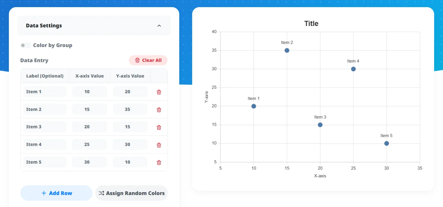
Input Chart Data
Enter your X and Y axis values. Optionally, enter 'Labels' to display names next to points on the graph. By turning on 'Color by Group' and entering group names, you can automatically color-code and compare data from different categories.
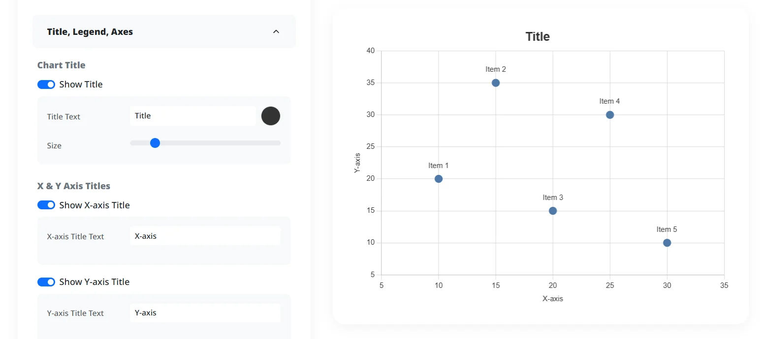
Customize Design
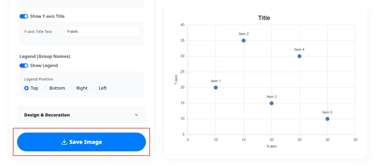
Fine-tune the design to match your chart's purpose. You can add a title, adjust point size, and set X and Y axis titles.
Save & Share Image
Once your design is complete, you can download it as a PNG image. On smartphones, you can also directly share it to social media via the share button.
Instant Correlation Mapping
Input your X and Y numerical data to immediately generate a scatter plot that clearly visualizes relationships and trends.
Effortless Point Labeling
Display custom text labels next to specific data points without struggling with complex formatting settings.
Color-Coding by Groups
Categorize your data points into distinct groups and assign them different colors for easy visual separation and comparison.
High-Resolution PNG Export
Download your customized scatter plot as a crisp, high-quality PNG image perfectly formatted for reports and presentations.
Analyze Data Relationships
Identify correlations, clusters, or outliers between two sets of variables, such as marketing spend and sales revenue.
Enhance Academic and Business Reports
Generate clear, professional scatter plots with labeled data points to support your research or business analysis.
Visualize Data on Mobile
Input data and create analytical charts directly from your smartphone, which is convenient for quick updates while away from your desk.
Can I use it on my smartphone?
Is my data safe?
Can I display names (labels) next to points?
Boost Tool's scatter plot maker simplifies the process of identifying trends, clusters, and outliers within your data. It addresses the common pain point of adding individual data labels and grouping colors, making it effortless to create detailed, analytical visuals. With professional color themes and adjustable gridlines, you can generate clear, publication-ready scatter plots for research papers, business analytics, or academic projects directly within your browser.
Ready to visualize your data with clear and beautiful scatter plots?