Radar Chart Maker
Create and save custom radar charts in your browser. Free online tool without registration or spreadsheet software.
Visualize Multi-Metric Balance and Relative Strengths
Free online radar chart maker to visualize multi-dimensional metric balance with spider and polygon graphs. Adjust metrics from 3 to 8 axes, apply 5-point or 100-point scales, set benchmark target lines, and overlay multiple datasets for direct comparison. Export clean PNG images with transparent backgrounds or copy directly to your clipboard.
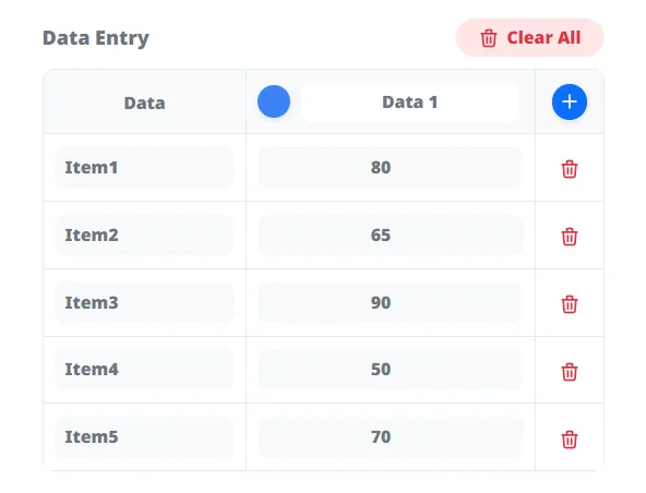
Enter Data
Input axis metrics and values. Add rows, paste spreadsheet data in bulk, and choose from curated color themes.
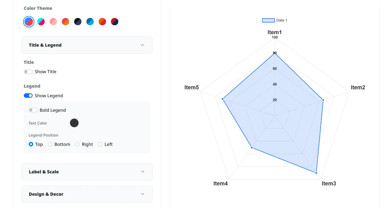
Customize Style
Select circular or polygon grids, adjust fill opacity, set custom scale limits (such as 5-point or 100-point ranges), and add benchmark lines.
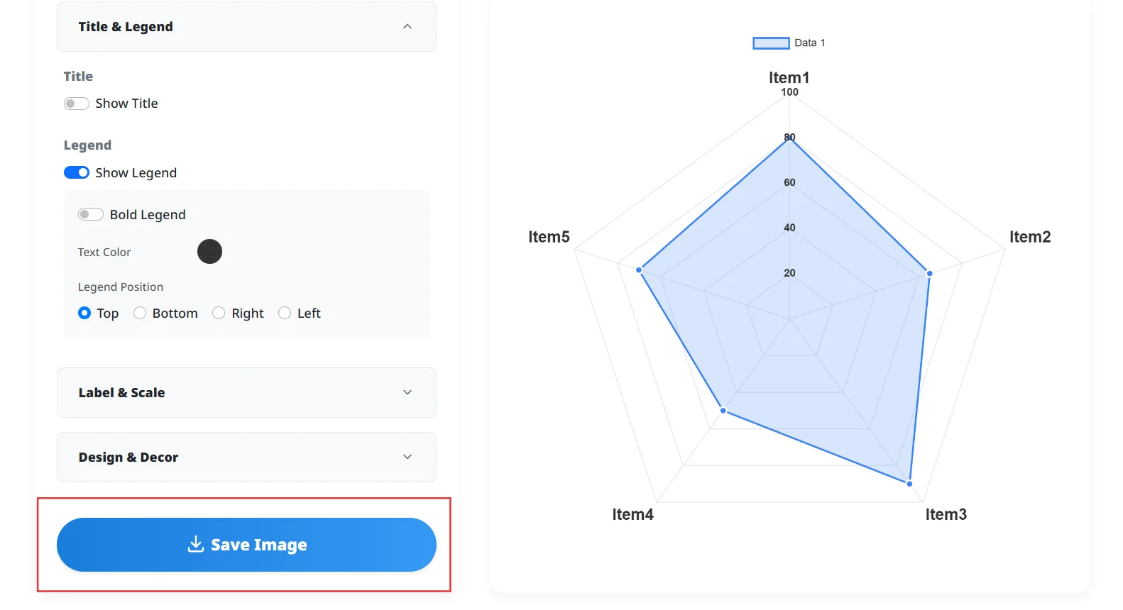
Export & Copy Image
Download high-resolution PNG images or copy directly to your clipboard for instant pasting into slides and documents. Mobile users can share via system menu.
Balanced Multi-Metric Visualization
Plots scores across multiple axes in real time to display relative strengths and weaknesses clearly.
Flexible Grids & Scales
Switch between polygon and circular grids, apply 5-point or 100-point scale presets, and show benchmark target lines.
Multi-Dataset Overlays
Add columns to compare multiple products, candidates, or historical metrics on a unified chart.
Image Export & Clipboard Copy
Export high-resolution PNG images with transparent background support, or copy images directly to your clipboard.
Product & Service Benchmark Comparisons
Evaluate price, performance, reliability, and usability against competitors on a single chart.
Competency Mapping & Skill Profiles
Summarize team skill matrices, personal evaluations, or character game stats into visual profiles.
Fast Charting Without Spreadsheets
Build clean radar charts directly in your browser without dealing with complicated Excel formatting.
Can I use this tool on mobile devices?
Can I change the number of polygon axes, like 5-sided or 6-sided charts?
Can I paste radar evaluation scores directly from Excel or Google Sheets?
Can I customize the axis scale, such as 5-point or 100-point systems?
Can I use generated charts in presentations or for commercial use?
Generate clear visual comparisons in your browser with circular or polygon grids, custom scale limits, benchmark lines, and transparent PNG export. Useful for product benchmarking, talent competency mapping, and status evaluations.
Create Your Radar Chart Now