Online Line Graph Maker
Enter time-series data to create line and area charts. Save images or copy to clipboard directly from your browser.
Create Line Graphs Online in Your Browser
Create line graphs and area charts directly in your browser without spreadsheet software. Plot time-series trends, compare multiple lines, overlay target benchmark lines, and display numerical labels. Save high-resolution PNG images or copy charts straight to your clipboard.
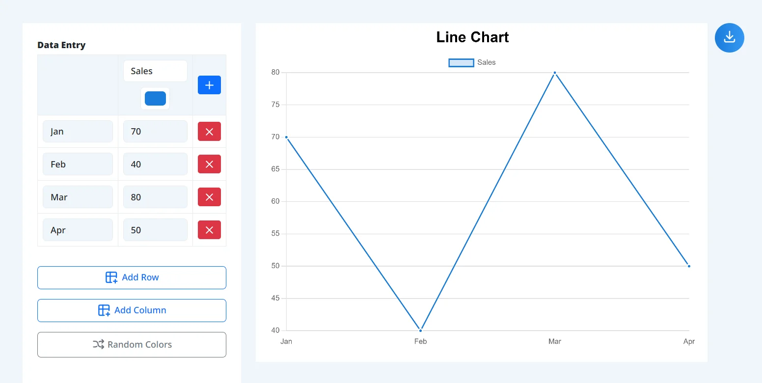
1. Enter or Paste Data
Input time-series labels (months, dates, or quarters) and values directly into the table. You can paste spreadsheet tables directly using "Paste from Excel", or add columns to compare multiple lines and track year-over-year trends.
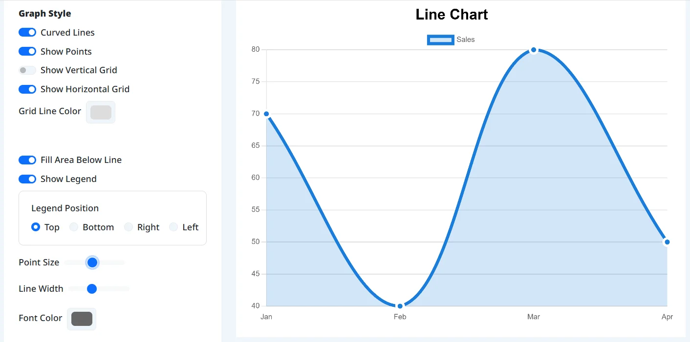
2. Adjust Styles, Axes & Target Lines
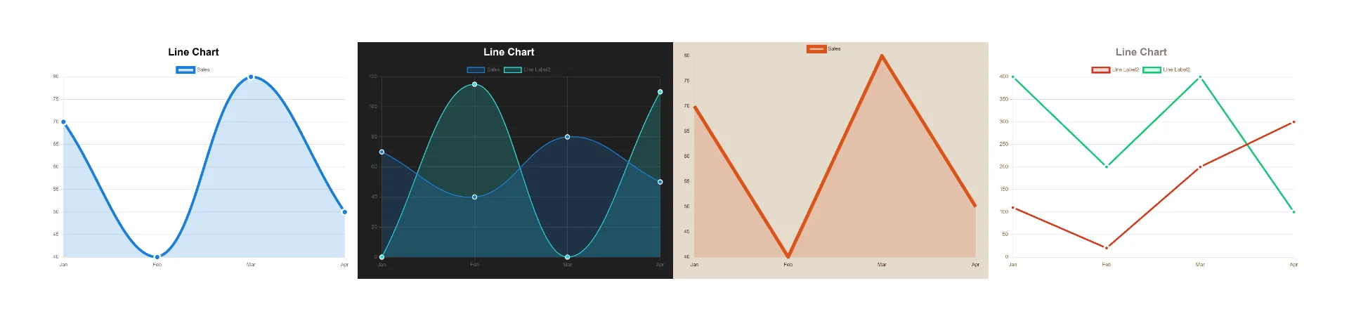
Select one of the 8 color themes or customize line thickness, curve smoothness, dashed or stepped patterns, and point markers. Configure numerical data labels, set min and max axis ranges, or overlay target reference lines.
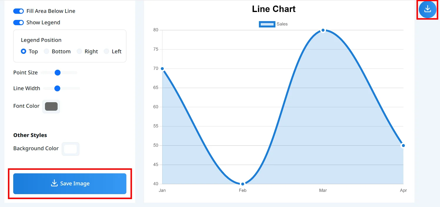
3. Save Image or Copy to Clipboard
Export your finished line graph as a PNG image, or click "Copy Image" to paste it directly into presentations, pitch decks, and monthly reports.
Real-Time Preview
See data updates, colors, and layout adjustments render on the canvas in real time.
8 Curated Color Palettes
Apply balanced color schemes tailored for business presentations, dark modes, and reports.
Area & Stepped Line Modes
Fill under lines for area charts or use stepped lines for inventory and discrete status changes.
Target Lines & Data Labels
Overlay reference benchmarks and render values with prefixes and suffixes on each point.
Direct Clipboard Copy
Copy high-resolution chart images directly to your clipboard for pasting into slides.
Browser-Based & Private
Runs entirely on client hardware with no account signups or software installations required.
Reporting Revenue & Traffic Trends
Present monthly, quarterly, or annual progressions with clear trajectory lines.
Tracking Target vs Actual Metrics
Display a horizontal reference line to compare actual performance against goals.
Preparing Slides and Presentation Decks
Paste tables from Excel or Sheets and copy charts straight into presentation decks.
Visualizing Volume with Area Charts
Fill regions under curves to convey cumulative volumes and composition shifts over time.
Building Charts on Mobile Devices
Input data and adjust settings with touch controls while keeping the chart preview in view.
Can I use this tool on smartphones or tablets?
Can I use the created charts for commercial purposes?
Is my data transmitted to a server?
Can I customize the chart colors?
Can I add a horizontal target or benchmark line to the trend chart?
How can I make line graphs clearer for presentations?
When should I use a line graph versus a bar chart?
Can I display numbers directly on data points?
What types of data work best with line graphs?
Build publication-quality line graphs and trend charts directly in your browser without Excel. Compare multiple series, add target lines, and export presentation-ready visuals in seconds.
Create your line graph now